Online experiments (A/B tests and randomized controlled trials) help us compare a control and a treatment by randomizing who sees what. A Bayesian lens keeps uncertainty front‑and‑center: as data arrives, we update beliefs and read posteriors as degrees of confidence about effects.
Metric Selection & Design
Start with the decision you want to make. Prefer simple, attributable metrics (e.g., conversion) and reach for composites only when they reflect a clear trade‑off (e.g., a weighted blend of sign‑ups and cancellations). Write down guardrails up front (e.g., latency, error rate) so wins don’t come at the wrong cost.
Distribution Types
Binary outcomes (convert/not): Bernoulli at the user level; in aggregate, Binomial with a conjugate Beta prior.
Counts (sessions, clicks): often Poisson or Negative Binomial.
Continuous (time on page, revenue): commonly Normal after trimming/skew handling.
Choose a likelihood that reflects how the data is generated -- not just what’s convenient.
Conversion Rate
Conversion is the share of users who take an action (e.g., free → paid). With a Beta prior and Bernoulli likelihood, observing successes and failures simply updates the Beta’s parameters: the posterior stays in the same family and is easy to interpret.
Beta Distribution Basics
Beta(a, b) lives on [0,1]. Its mean is a/(a+b). Larger (a+b) means more information and a tighter distribution. With a uniform prior Beta(1,1), seeing s successes and f failures yields Beta(1+s, 1+f).
Beta(a=2, b=8) density on [0,1] Show Python source
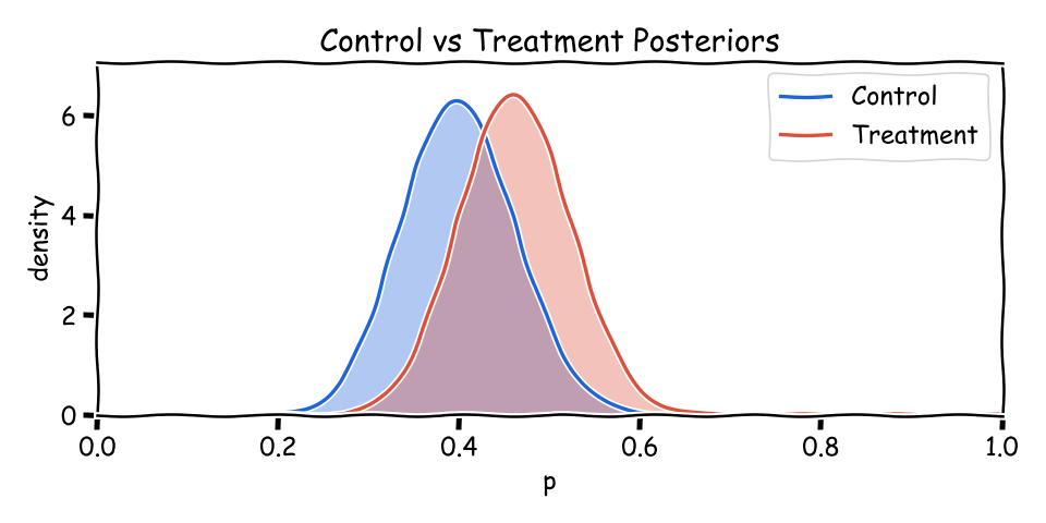
When comparing variants, we often summarize control and treatment as Beta(a_c, b_c) and Beta(a_t, b_t). Overlap shows uncertainty; less overlap means clearer separation. The mean of each is a/(a+b).
Overlapping posteriors for control and treatment Show Python source
import math
import matplotlib
matplotlib.use('Agg')
import matplotlib.pyplot as plt

FT_BG = '#FFF1E5'
FT_CLARET = '#990F3D'
FT_OXFORD = '#0F5499'
FT_TEAL = '#0D7680'

plt.rcParams.update({
    'figure.facecolor': FT_BG,
    'axes.facecolor': FT_BG,
    'savefig.facecolor': FT_BG,
    'font.family': 'sans-serif',
    'font.sans-serif': ['Helvetica Neue', 'Arial', 'sans-serif'],
    'axes.spines.top': False,
    'axes.spines.right': False,
})

def beta_pdf(x, a, b):
    x = min(max(x, 1e-6), 1-1e-6)
    lg = math.lgamma
    logB = lg(a) + lg(b) - lg(a+b)
    logpdf = (a-1)*math.log(x) + (b-1)*math.log(1-x) - logB
    return math.exp(logpdf)

xs = [i/1000 for i in range(0,1001)]
y1 = [beta_pdf(x, 24, 36) for x in xs]
y2 = [beta_pdf(x, 30, 35) for x in xs]

fig, ax = plt.subplots(figsize=(8,4))
ax.fill_between(xs, y1, color=FT_OXFORD, alpha=0.25)
ax.fill_between(xs, y2, color=FT_CLARET, alpha=0.25)
ax.plot(xs, y1, color=FT_OXFORD, linewidth=2, label='Control')
ax.plot(xs, y2, color=FT_CLARET, linewidth=2, label='Treatment')
ax.set_xlim(0,1)
ax.set_ylim(0, max(max(y1), max(y2))*1.1)
ax.set_xlabel('p', fontsize=11, color='#333333')
ax.set_ylabel('density', fontsize=11, color='#333333')
ax.legend()

fig.text(0.5, 0.97, 'Control vs Treatment Posteriors',
         ha='center', fontsize=14, fontweight='bold', color='#333333')
fig.text(0.02, 0.01, 'Source: Philip Jama via pjama.github.io',
         fontsize=8, color='#999999', ha='left')
fig.tight_layout(rect=[0, 0.03, 1, 0.92])
fig.savefig('two_posteriors.png', dpi=150, bbox_inches='tight')

print('wrote two_posteriors.png')
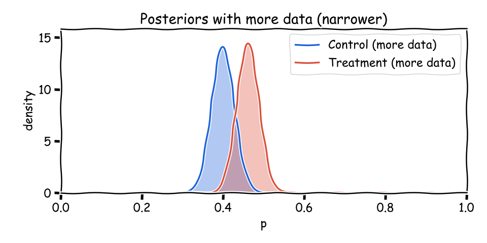
Updating as Data Arrives
As more users arrive, (a+b) grows and each posterior narrows. The means can stay similar while uncertainty shrinks: that’s exactly what you want from accumulating evidence.
Posteriors become narrower with more data Show Python source
import math
import matplotlib
matplotlib.use('Agg')
import matplotlib.pyplot as plt

FT_BG = '#FFF1E5'
FT_CLARET = '#990F3D'
FT_OXFORD = '#0F5499'
FT_TEAL = '#0D7680'

plt.rcParams.update({
    'figure.facecolor': FT_BG,
    'axes.facecolor': FT_BG,
    'savefig.facecolor': FT_BG,
    'font.family': 'sans-serif',
    'font.sans-serif': ['Helvetica Neue', 'Arial', 'sans-serif'],
    'axes.spines.top': False,
    'axes.spines.right': False,
})

def beta_pdf(x, a, b):
    x = min(max(x, 1e-6), 1-1e-6)
    lg = math.lgamma
    logB = lg(a) + lg(b) - lg(a+b)
    logpdf = (a-1)*math.log(x) + (b-1)*math.log(1-x) - logB
    return math.exp(logpdf)

xs = [i/1000 for i in range(0,1001)]
y1 = [beta_pdf(x, 24*5, 36*5) for x in xs]
y2 = [beta_pdf(x, 30*5, 35*5) for x in xs]

fig, ax = plt.subplots(figsize=(8,4))
ax.fill_between(xs, y1, color=FT_OXFORD, alpha=0.25)
ax.fill_between(xs, y2, color=FT_CLARET, alpha=0.25)
ax.plot(xs, y1, color=FT_OXFORD, linewidth=2, label='Control (more data)')
ax.plot(xs, y2, color=FT_CLARET, linewidth=2, label='Treatment (more data)')
ax.set_xlim(0,1)
ax.set_ylim(0, max(max(y1), max(y2))*1.1)
ax.set_xlabel('p', fontsize=11, color='#333333')
ax.set_ylabel('density', fontsize=11, color='#333333')
ax.legend()

fig.text(0.5, 0.97, 'Posteriors with More Data',
         ha='center', fontsize=14, fontweight='bold', color='#333333')
fig.text(0.5, 0.935, 'Narrower distributions as sample size increases',
         ha='center', fontsize=10, color='#666666')
fig.text(0.02, 0.01, 'Source: Philip Jama via pjama.github.io',
         fontsize=8, color='#999999', ha='left')
fig.tight_layout(rect=[0, 0.03, 1, 0.92])
fig.savefig('narrowing.png', dpi=150, bbox_inches='tight')

print('wrote narrowing.png')
Interpreting Overlap
When the curves overlap, both variants remain plausible. Report the probability that treatment beats control, plus a credible interval for the difference. These are honest statements about uncertainty -- not all‑or‑nothing verdicts.
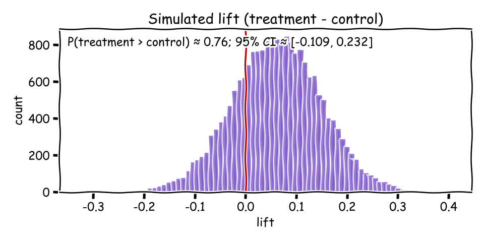
Simulation via Sampling
A friendly way to summarize is by simulation: draw many samples from each posterior, compute the lift (p_treat − p_control), then report P(lift > 0) and a credible interval. This Monte Carlo view turns curves into numbers you can act on.
Histogram of simulated lift (treatment minus control) Show Python source
import random, math
import matplotlib
matplotlib.use('Agg')
import matplotlib.pyplot as plt

FT_BG = '#FFF1E5'
FT_CLARET = '#990F3D'
FT_OXFORD = '#0F5499'
FT_TEAL = '#0D7680'

plt.rcParams.update({
    'figure.facecolor': FT_BG,
    'axes.facecolor': FT_BG,
    'savefig.facecolor': FT_BG,
    'font.family': 'sans-serif',
    'font.sans-serif': ['Helvetica Neue', 'Arial', 'sans-serif'],
    'axes.spines.top': False,
    'axes.spines.right': False,
})

# Posterior parameters (match earlier example)
a1,b1 = 24,36   # control
a2,b2 = 30,35   # treatment

N = 20000
samples = []
for _ in range(N):
    pc = random.betavariate(a1, b1)
    pt = random.betavariate(a2, b2)
    samples.append(pt - pc)

p_better = sum(1 for x in samples if x > 0) / N
lo, hi = sorted(samples)[int(0.025*N)], sorted(samples)[int(0.975*N)]

fig, ax = plt.subplots(figsize=(8,4))
ax.hist(samples, bins=80, color=FT_TEAL, alpha=0.7)
ax.axvline(0.0, color=FT_CLARET, linewidth=2)
ax.set_xlabel('lift', fontsize=11, color='#333333')
ax.set_ylabel('count', fontsize=11, color='#333333')
msg = f"P(treatment > control) \u2248 {p_better:.2f}; 95% CI \u2248 [{lo:.3f}, {hi:.3f}]"
ax.text(0.02, 0.95, msg, transform=ax.transAxes, va='top', fontsize=10, color='#333333',
        bbox=dict(boxstyle='round', facecolor=FT_BG, edgecolor='#cccccc', alpha=0.9))

fig.text(0.5, 0.97, 'Simulated Lift (Treatment \u2212 Control)',
         ha='center', fontsize=14, fontweight='bold', color='#333333')
fig.text(0.02, 0.01, 'Source: Philip Jama via pjama.github.io',
         fontsize=8, color='#999999', ha='left')
fig.tight_layout(rect=[0, 0.03, 1, 0.92])
fig.savefig('delta_hist.png', dpi=150, bbox_inches='tight')

print('wrote delta_hist.png')
print(msg)
Reading Results
Report P(treatment > control) and a credible interval for the lift.
Translate to plain language (e.g., “There is a 0.86 probability the treatment’s conversion rate exceeds control by 0.5–3.2 pp.”).
Check practicality: does the interval clear your minimum effect and respect guardrails?
Conclusion
A Bayesian approach keeps uncertainty visible from start to finish. By modeling conversion with Beta posteriors, visualizing overlap, and simulating lift, you can make measured, decision‑ready calls grounded in data -- not just a p‑value.
The posteriors and credible intervals here assume a fixed sample size, but what if you could reach the same confidence with fewer participants?
![Beta(a=2, b=8) density on [0,1]](/articles/online-experiments-bayesian/assets/beta_ab.png)