Philip Jama

Articles /Network Graph Analysis /Part 1

Foundations

Graph representations, key metrics, and visualization with NetworkX

Graph TheoryPythonNetworkXTutorial

Graphs are everywhere: social networks, transportation routes, biological pathways, the internet itself. A graph is simply a set of nodes connected by edges, yet this minimal structure encodes rich relational information that matrices and tables miss. This article lays the groundwork for a series on network graph analysis: starting with the representations, metrics, and visualizations you need to reason about any network.

The series draws on three portfolio projects that use graph techniques: Calendar Graph project ↗ (organizational network analysis), Graphception project ↗ (concept extraction and associative networks), and Books project ↗ (LLM-generated outlines as tree graphs).

What Is a Graph and Why It Matters

A graph G = (V, E) consists of a vertex set V and an edge set E. Edges can be directed or undirected, weighted or unweighted. This abstraction lets us model friendships, citations, dependencies, and countless other relationships in a single framework.

Representations: Adjacency Matrix, Edge List, Adjacency List

How you store a graph matters. An adjacency matrix is an n×n array where entry (i,j) indicates an edge between nodes i and j: great for dense graphs and linear algebra. An edge list is a simple collection of (u, v) pairs: compact and easy to stream. An adjacency list maps each node to its neighbors: ideal for sparse graphs and traversal algorithms. NetworkX abstracts over these, but understanding the tradeoffs guides performance decisions.

Key Metrics: Degree, Clustering, Path Length, Density

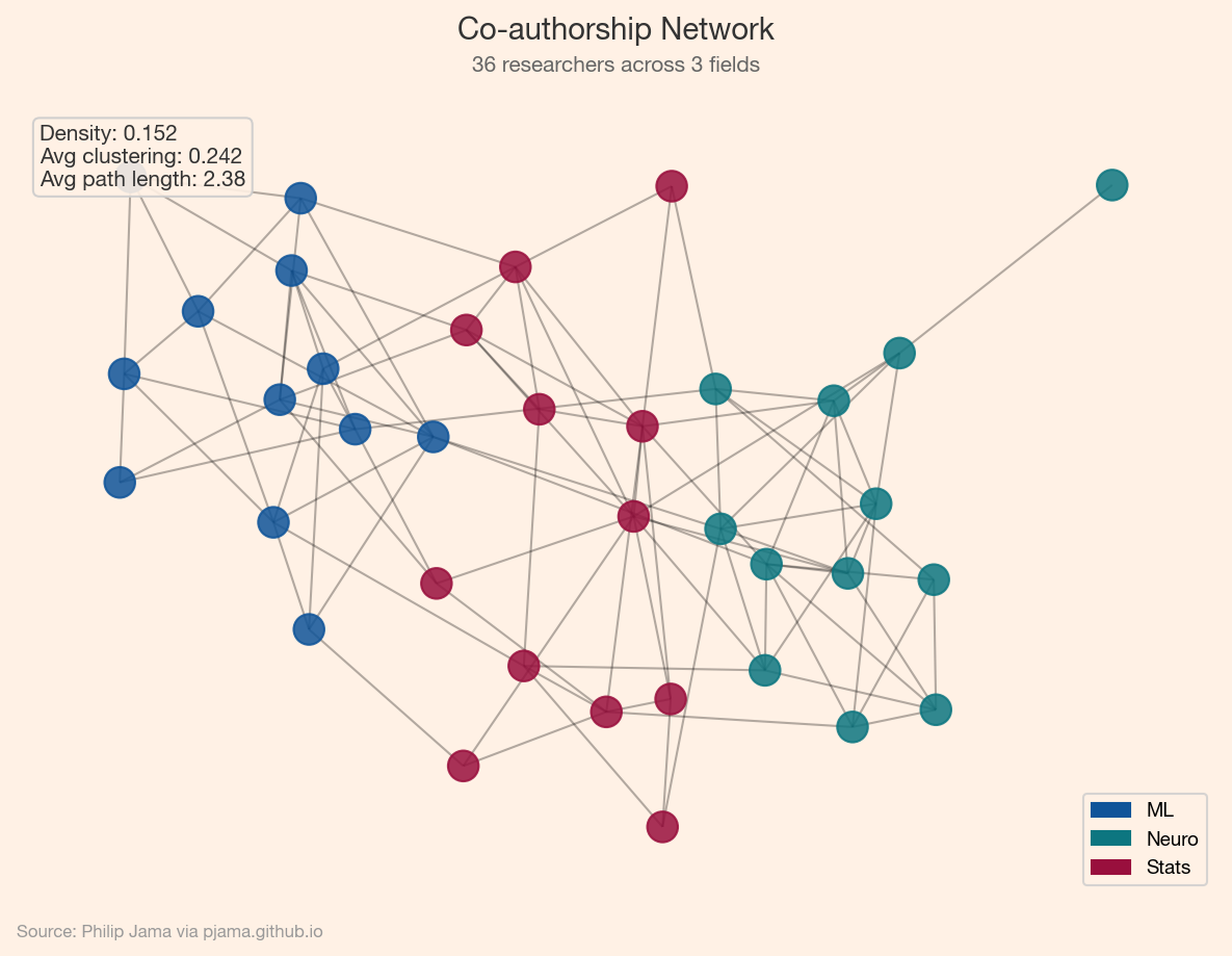
A handful of metrics capture a graph’s structure:

  • Degree: how many connections a node has. The degree distribution often reveals whether a network is random, scale-free, or something else.
  • Clustering coefficient: the fraction of a node’s neighbors that are also connected to each other. High clustering suggests tight-knit communities.
  • Average shortest path length: the typical number of hops between any two nodes. Small-world networks have short paths despite high clustering.
  • Density: the ratio of actual edges to possible edges. Most real-world networks are sparse.
Small-world network with spring layout and annotated metrics
Show Python source
import networkx as nx
import numpy as np
import matplotlib
matplotlib.use('Agg')
import matplotlib.pyplot as plt
from matplotlib.colors import LinearSegmentedColormap
import random

FT_BG = '#FFF1E5'
FT_CLARET = '#990F3D'
FT_OXFORD = '#0F5499'
FT_TEAL = '#0D7680'

plt.rcParams.update({
    'figure.facecolor': FT_BG,
    'axes.facecolor': FT_BG,
    'savefig.facecolor': FT_BG,
    'font.family': 'sans-serif',
    'font.sans-serif': ['Helvetica Neue', 'Arial', 'sans-serif'],
    'axes.spines.top': False,
    'axes.spines.right': False,
})

random.seed(42)
np.random.seed(42)

G = nx.watts_strogatz_graph(30, 4, 0.3, seed=42)
avg_cl = nx.average_clustering(G)
avg_pl = nx.average_shortest_path_length(G)
degrees = [d for n, d in G.degree()]

ft_cmap = LinearSegmentedColormap.from_list('ft', [FT_OXFORD, FT_TEAL, FT_CLARET])

fig, ax = plt.subplots(figsize=(8, 6))
pos = nx.spring_layout(G, seed=42)
nx.draw_networkx_edges(G, pos, ax=ax, alpha=0.3, width=1.2)
nx.draw_networkx_nodes(G, pos, ax=ax, node_size=[d*80+60 for d in degrees],
                       node_color=degrees, cmap=ft_cmap, alpha=0.85)
stats = f'Avg degree: {np.mean(degrees):.1f}\nClustering coeff: {avg_cl:.3f}\nAvg path length: {avg_pl:.2f}'
ax.text(0.02, 0.98, stats, transform=ax.transAxes, va='top',
        fontsize=10, color='#333333',
        bbox=dict(boxstyle='round', facecolor=FT_BG, edgecolor='#cccccc', alpha=0.9))
ax.set_axis_off()

fig.text(0.5, 0.97, 'Watts-Strogatz Small-World Network',
         ha='center', fontsize=14, fontweight='bold', color='#333333')
fig.text(0.5, 0.935, 'n=30 nodes, k=4 neighbors, rewiring p=0.3',
         ha='center', fontsize=10, color='#666666')
fig.text(0.02, 0.01, 'Source: Philip Jama via pjama.github.io',
         fontsize=8, color='#999999', ha='left')
fig.tight_layout(rect=[0, 0.03, 1, 0.92])
fig.savefig('sample_network.png', dpi=150, bbox_inches='tight')

print('wrote sample_network.png')

Visualization Approaches

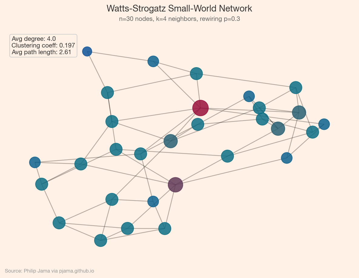
Layout algorithms turn abstract graphs into spatial pictures:

  • Force-directed (spring): treats edges as springs and nodes as repelling charges. Good for revealing clusters.
  • Hierarchical: arranges nodes in layers. Suited for DAGs and tree-like structures.
  • Circular: places nodes on a ring. Useful for comparing connectivity patterns.

No layout is objectively best: each reveals different aspects of the same graph.

Co-authorship network colored by research field with metric annotations
Show Python source
import networkx as nx
import numpy as np
import matplotlib
matplotlib.use('Agg')
import matplotlib.pyplot as plt
from matplotlib.patches import Patch
import random

FT_BG = '#FFF1E5'
FT_CLARET = '#990F3D'
FT_OXFORD = '#0F5499'
FT_TEAL = '#0D7680'

plt.rcParams.update({
    'figure.facecolor': FT_BG,
    'axes.facecolor': FT_BG,
    'savefig.facecolor': FT_BG,
    'font.family': 'sans-serif',
    'font.sans-serif': ['Helvetica Neue', 'Arial', 'sans-serif'],
    'axes.spines.top': False,
    'axes.spines.right': False,
})

random.seed(42)
np.random.seed(42)

# Synthetic co-authorship network: 36 researchers in 3 fields
fields = ['ML']*12 + ['Neuro']*12 + ['Stats']*12
field_colors = {'ML': FT_OXFORD, 'Neuro': FT_TEAL, 'Stats': FT_CLARET}
n = 36
G = nx.Graph()
for i in range(n):
    G.add_node(i, field=fields[i])
for i in range(n):
    for j in range(i+1, n):
        p = 0.35 if fields[i] == fields[j] else 0.04
        if random.random() < p:
            G.add_edge(i, j)

colors = [field_colors[fields[i]] for i in range(n)]
density = nx.density(G)
avg_cl = nx.average_clustering(G)
cc = max(nx.connected_components(G), key=len)
avg_pl = nx.average_shortest_path_length(G.subgraph(cc))

fig, ax = plt.subplots(figsize=(8, 6))
pos = nx.spring_layout(G, seed=42)
nx.draw_networkx_edges(G, pos, ax=ax, alpha=0.3, width=1)
nx.draw_networkx_nodes(G, pos, ax=ax, node_color=colors, node_size=200, alpha=0.85)
stats = f'Density: {density:.3f}\nAvg clustering: {avg_cl:.3f}\nAvg path length: {avg_pl:.2f}'
ax.text(0.02, 0.98, stats, transform=ax.transAxes, va='top',
        fontsize=10, color='#333333',
        bbox=dict(boxstyle='round', facecolor=FT_BG, edgecolor='#cccccc', alpha=0.9))
ax.legend(handles=[Patch(color=c, label=t) for t, c in field_colors.items()],
          loc='lower right', frameon=True, facecolor=FT_BG, edgecolor='#cccccc',
          fontsize=9)
ax.set_axis_off()

fig.text(0.5, 0.97, 'Co-authorship Network',
         ha='center', fontsize=14, fontweight='bold', color='#333333')
fig.text(0.5, 0.935, '36 researchers across 3 fields',
         ha='center', fontsize=10, color='#666666')
fig.text(0.02, 0.01, 'Source: Philip Jama via pjama.github.io',
         fontsize=8, color='#999999', ha='left')
fig.tight_layout(rect=[0, 0.03, 1, 0.92])
fig.savefig('karate_metrics.png', dpi=150, bbox_inches='tight')

print('wrote karate_metrics.png')

Series Roadmap

With these foundations in place, the series branches into three directions:

Branch A: Social & Organizational Networks

Branch B: Knowledge Graphs

Branch C: Graph Deep Learning

Each branch builds on the representations and metrics introduced here.

Degree distributions and clustering coefficients describe a graph's texture -- but the most useful structure is often hidden in densely connected subgroups.

View all articles in Network Graph Analysis

Collaborate

If you're exploring related work and need hands-on help, I'm open to consulting and advisory. Get in touch